
Map Designer: Manabu Okano
■Our aims with the mapmaking process and goals for the future
Hello! This is Okano, I was in charge of map creation.
I love creating miniature gardens where I can roam around freely, so I was very happy to be part of this work.
[Fusion of the ideal future image of the 1970s and modern design]

At first, when I was creating the map images, I had a lot of ideas for natural objects, but I couldn't quite come up with the images of cities, airports, etc.
When I think of images from the 70s, I see huge buildings with a lot of streamlining, but designing cities and military facilities in those shapes is so far-fetched that it causes problems such as lack of scale and realistic detail, and the limitations of polygon display.
There is a difference between the streamlined shapes of Neucom and the linear shapes of General Resource, but they could not have been made without including modern reality as a premise.
[Changes in the look of the cities and nature by time of day]
In this work, the same map may appear more than once, depending on the scenario.
Megafloat, for example, has a variety of light source settings: morning, noon, dusk, and night-time. There are maps where things that didn't exist there before are now there after some time has passed, so we're more aware of the passage of time within the same world than in previous games. I hope you'll enjoy the changing appearances of this world.
[If I ever get a chance to make my next installment]

Secondly, I want to walk around the miniature world from the perspective of a resident of the world. For example, when I was young, I witnessed Dision's plane taking off from a General airport while looking at the sky. And that would make me want to join General.
[Finally]
As an aside, the seven domes in the city of Port Edwards were originally built up to the inside of the building (it was scrapped due to heavy processing). The setting was a multi-purpose dome with a modified stadium inside for circuits and ball games, and the ceiling was a large screen.
(end page 1)
(start page 2)
Character Designer: Mamoru Takahashi
Art Director: Takaharu Suzuki
Takaharu: "Hi, I'm Suzuki, and I was in charge of the print design for AC3."
Mamoru: "Hi, I'm Takahashi, the character designer."
Takaharu: "The two of us together..."
Mamoru: "...Wait, why do we have to be like a comedy duo?"
Takaharu: "Oh, I'm sorry. (laughs)"
Mamoru: "C'mon, man..."
Takaharu: "Let's try that again, are you all enjoying Electrosphere?"

Takaharu: "Well, this is a relay essay on AC3, but I'd like to proceed in a slightly different way, in the form of a conversation between the two of us. Please bear with us. Now, Mamoru, you created your characters quite early on, didn't you?~"
Mamoru: "Yes, I did. I started drawing the rough sketches when the story was still only roughly decided. Many characters were rejected... (sad face)."
Takaharu: "After Dai Satō from Frognation became involved in the script and the concepts, you were able to design pretty quickly, weren't you?"
Mamoru: "Yes, it's easy to design when the story and character designs are finalized.
Takaharu: "By concept, do you mean their personalities?"
Mamoru: "When designing characters, there is a big difference between knowing the character's personality and not knowing it.
Dai Sato had a clear image of the people and their backgrounds, so all I had to do was expand the image from there.''
Takaharu: "Was there anything that bothered you, visually speaking?"
Takaharu: "Were you happy when you saw your drawings animated?"
Mamoru "I couldn't believe my eyes~. They were actually moving."
Takaharu: "Is it difficult to draw for animation?
Mamoru: "Well~, hmmm..."
Takaharu: "If the designs are too complicated, the animators will have a hard time animating them."
Mamoru "I wanted to go for a rather hard-edged realistic design, nothing too cartoony (?), but in the end, I need them to be animatable.
So I settled on that kind of compromise. I could have drawn them more realistic and austere, but I didn't want them to look out of place in the cutscenes."
(end page 2)
(start page 3)
Takaharu: "Which character do you like the most?"
Takaharu: "Simon~? Oh, Simon started out as a female character."

Takaharu: "...A shaved head... fetish...?"
Mamoru: "..."
Takaharu: "..."
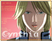
Mamoru: "Takaharu, you also said you liked Yoko's lab coat... if I'm not mistaken."
Takaharu: "..."
Mamoru: "..."
Takaharu: "What about Rena? You were also very particular about Rena, oddly enough..."
Mamoru: "...Oh, it wasn't a special feeling, she was just difficult to draw, yeah."
Takaharu: "Yeah, yeah. Well, anyway."
Mamoru: "Why don't we talk about that? You made the jacket and everything, but your usual title is not that of package designer. Were you promoted to art director this time? (laughs)"
Takaharu: "(laughs) Yes. I mean, I did all the planning, direction, and design for the Photosphere. I get tired just thinking about it."
Mamoru: "Mr. Sashida did the design for the game, did you take care to keep the visuals consistent?"
Takaharu: "Of course. But it was difficult. That's because the only thing the project team wanted from the package was, 'Make it sellable!', point blank... I thought long and hard about what would be the best way to sell the game while keeping the image of the game in mind. In the end, I designed it with a textbook balance."
Mamoru: "What do you mean by 'textbook balance'?"
Takaharu: "It's an image that appeals to both hardcore shooting fans and fans of science fiction stories and animation. I thought it would sell well if it appealed to both types of fans. That was my line of thinking.
If you only have fighters like in AC2, we won't be able to attract sci-fi story fans, and if you focus Mamoru's characters as the main character, you'll probably lose the shooting fans."
Mamoru: "I see. Also, the logo for this time is not the phoenix image from the first and second games in the series, is it because it doesn't fit the world?
Takaharu: "Yes, I designed the future of AC3 to be 'gritty and fantastic'. By fantastic, I mean retro-futuristic.

Mamoru: "Ivory white and orange."
Takaharu: "Yes, yes, you knew! (laughs)"
(end page 3)
(start page 4)
Mamoru: "The Photosphere was good, too. It was hard to draw the illustrations, though..."
Takaharu: "It's a lot of work, you never had to draw something under a tight deadline before..."
Mamoru: "Oh, no..."
Takaharu: "(laughs) But I really had a hard time with the Photosphere, but I'm glad we were able to get it to look like that."

Takashi: "Well, we had a lot of things going on... (distant look)"
Mamoru: "A lot of things... (distant look)"
Takaharu: "I thought it up when I saw AC3's huge amount of design materials. It's a great game, so I wanted users to be interested in it. That's why I planned a separate booklet, separate from the manual."
Mamoru: "We've used a lot of the characters. 'All the pages are newly drawn!' I cried when they said that..."
Takaharu: "Thank you for your hard work. You drew almost all of them. I'm grateful to the CG designers who helped me with the CG of the fighters other than the characters."
Mamoru - "It was really hard work, wasn't it...? (distant look)"
Takashi "(sweat)...Well, what was the most difficult illustration the Photosphere?
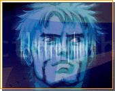
Mamoru: "Erich!"
Takaharu: "It's not very distinct, it's just a mundane one (laughs)."
Mamoru: "Yeah."
Takaharu: "Dision and Keith were fast."
Mamoru: "Yes, I can draw distinct characters quite well."
Takaharu: "Maybe that's how it is."
Mamoru: "Yeah, something like that. But I'm glad it's been well received by the users."
Takaharu: "Yes, it was. (I check everyone's emails and postcards closely.) Printed materials for games don't attract much interest, so it's really nice to hear comments such as, 'It was cool'".
Mamoru: "I wish I could work like that againー"
Takaharu: "You said it... (grin)."
Mamoru: "...*thump*... So, if you'll excuse me, I have to go."
Takaharu: "One last thing! The Ace Combat 3 wallpaper giveaway with the most popular 'Fi' desktop!

Takaharu: "It's a Mac layout, so if you're on Windows, please move the menu bar up."
Mamoru: "How selfish..."
Takaharu: "It's because I'm on a Mac..."
(end page 4)
(start page 5)
Concept Designer: Kei Yoshimizu
Hello, everyone. I'm Yoshimizu and I was in charge of "concept design."
Now, what is "concept design," exactly? But the point is behind the scenes. From the very beginning of the project, this is the role of thinking about the direction and visual style of the game, and coming up with ideas for image boards, design drafts, plots, and settings.

However, in terms of visual imagery, I felt that there needed to be something novel and not a stereotypical dystopian image, so I started looking for it. At that time, I felt that the design of the '50s and '70s had a straightforward view of the future, and I thought it would be interesting to rearrange it, so I decided on the basic concept of the world view.
This utopian view of the world is also shared by the corporate commercials that appear in the play, and is directly related to the cyber worship which is revealed in the second half of the story, and I believe that I was able to express the gap between the two.
Electrosphere" is two CDs that are 120% made with the staff's desire to try new things. I'm hoping that as many people as possible will play the game and get their message across.
(end page 5)
(start page 6)
Graphic Design: Minoru Sashida
Hey there. Sashida here.
Some of you may know me a little bit, but I was still in an electronics store one time.
It was the summer of 1998, when the development of Techno Drive (*1) was almost finished and I was wandering around the company when I bumped into Iwasaki in the hallway. When I asked him about it, he said he was making some kind of airplane game. Standing there, I said, "What are you up to? (*2), but before I knew it, I was actually going to participate in the event.
At first, I was like, "Is it OK for me to do this? I was so touched by the thought of "We'll do our best, We'll do something new and different from previous ACEs" that I cried and decided to follow them to the bottom of hell. (Part of the story has been adapted) So, of course, this is the first time I've tried it for home use. It was a lot of hard work. Yeah.
With that said, I'd like to talk about the graphics aspect of the game I was in charge of this time.
I was in charge of the 2D parts around the system, including the Data Swallow(*3) and the HUD, as well as the design of the marks and logos that supplement the world view.
When I first heard about the world view, I received a rather crude order of "I'd like to do something online in cyber space...", so I honestly thought, "Wow, this might look lame if I don't do it well...", and with a sense of crisis, I searched for a way to achieve it.
It's basically a futuristic Internet browser, but I had a lot of trouble incorporating the "visualized brain space" into its structure.
I was thinking that it would be bad if grid lines(*4) were laid out in a pitch black space, and it's too late to depict high density cyber space like the JM movie... Then I suddenly remembered the mega demo(*6) that my friend Spin Teramoto(*5) showed me before, and I combined it with the futuristic atmosphere of the 60's and 70's in my mind, which is the keyword this time, and I was determined to create the tube-like(*7) presentation that is the background of Data Swallow.
Even the movement of each element was deliberately shifted slightly, forcing the programmer to do so to give it a slightly old-fashioned analog feel. Rather than digital, it looks like an incredibly precise mechanical device. If you listen carefully to the sound effects, you'll understand that I asked Nakanishi to put in some mechanical noises on purpose (*8).
It has a nostalgic, fantastical atmosphere, and a hard, futuristic outlook. That is the design concept for this time. He believes that it's very cool. Did you notice it?
(end page 6)
(start page 7)
Well, it's easy to say, but making it was... well, it was hard to make. After all, it's a game with a huge amount of information. Just to put it all together, the programmer is in a dilemma and comes up with an unexpectedly elaborate system screen specification... Total ignorance is a terrifying thing. (Hey!)
But there were a lot of specifications that we cried because of Namco's elite unit's (?) timeout, but the programmer's desperate efforts were worth it, and I think we were able to achieve the wonderful finish that we envisioned.
(*1)
Self-proclaimed world's strongest electromechanical car. Click here for more details
(*2)
The truth is, it's bad to talk about these things in the hallway.
(*3)
The name "Data Swallow" actually has an original story. But it's a secret.
The hint is the Osaka Expo.
(*4)
It was a common expression in 80's anime. Is the film TRON the source?
(*5)
Interesting guy who worked on R4.
(*6)
This is a work of art that uses advanced compression techniques to express itself on a single floppy volume.
(*7)
In the beginning, it didn't work out very well programmatically or design-wise, and texture testing was repeated endlessly. I feel bad when I think about it.
(*8)
At the beginning, when we heard the sound given to the Data Swallow, it sounded so "SF" that we were all holding our breaths without even noticing it.
Um, do you mind if I write some more? It's the web, so it's OK, right?
Another big job. That's the logo design for the organization or company that appears in the story. If you've played this game, you'll know that it's a story that progresses through multiple organizations, sometimes transferring from one organization to another. In order to make such a setting easier to understand and more persuasive, we have set the logo mark of each organization. A company's logo is an expression of the company's identity, so it should be able to convey its atmosphere at a glance.

The General is a star design with absolute power. Neucom is a young and flexible company, so it's all about vivid colors and sleek lines... UPEO is a peacekeeping organization with the symbolic placement of a dove that's a little more accessible. I tried to make the design easy to understand first.
In addition, there are more than 30 kinds of logos, including those that appear in the background of the news screen and those that are only textures. And in each one, there is a back story. If you play with that in mind, you'll be able to immerse yourself in the world of the Electrosphere even more, so by all means, play the game over and over again and try to nitpick.
It is often pointed out that the Neucom logo is a bit similar to the Namco logo, but it's not their imagination. It's because Neucom's corporate stance of constantly pursuing new technologies is somehow similar to that of Namco. Yes, in my mind, Neucom is the Namco of 40 years from now. Man, there will be a war in 40 years, with my company. Better watch out.
(end page 7)
(start page 8)
Cutscene editing: Itomi Kosuke
My name is Itomi and I was in charge of editing the cutscenes.
I'm guessing that you've probably finished watching most of the EDs by now.
If you watch the game after playing it, you'll think, "What the heck is this all about?※Promotional video screened at the Tokyo Game Show. It is also included in the Namco Game Catalog '98 of the extra DISC of "R4".
I looked at the enormous amount of scripts and thought, 'Wow! How many discs do I have to work on?' I remember breaking out in a cold sweat and saying, "I'm going to do this."
From then on, I spent every day "staring" at all the characters.
I listen to the sound and edit the animation. Sometimes I would sit in front of the bathroom mirrorin the middle of the night muttering lines like the characters.
This time, the in-game cutscenes are not limited to 3D.
Of course, there is 3D, 2D animation, motion graphics, live-action, and so on.
In order to do so, I opened the drawers in my head and continued to explore new possibilities for expression. I've tried to pack something that will surprise you in a good way.
I hope you enjoy it from beginning to end.
The cutscenes that were not included are in the video cassette (ACECOMBAT3 Mission0). Check it out if you're interested.


No comments:
Post a Comment